My Art in Colors
Art, re-visualized with machine learning
Overview
What
My Art in Colors is a personal data visualization project. It uses machine learning to sort artwork according to dominant color hue and generate color palettes.
Who
Helen He
When
July - August 2019
Skills and tools
ML, Python, data visualization
Final project website
https://myartincolors.herokuapp.com/
Note: Application loads slowly, may need to refresh page if it doesn't load at first
Background
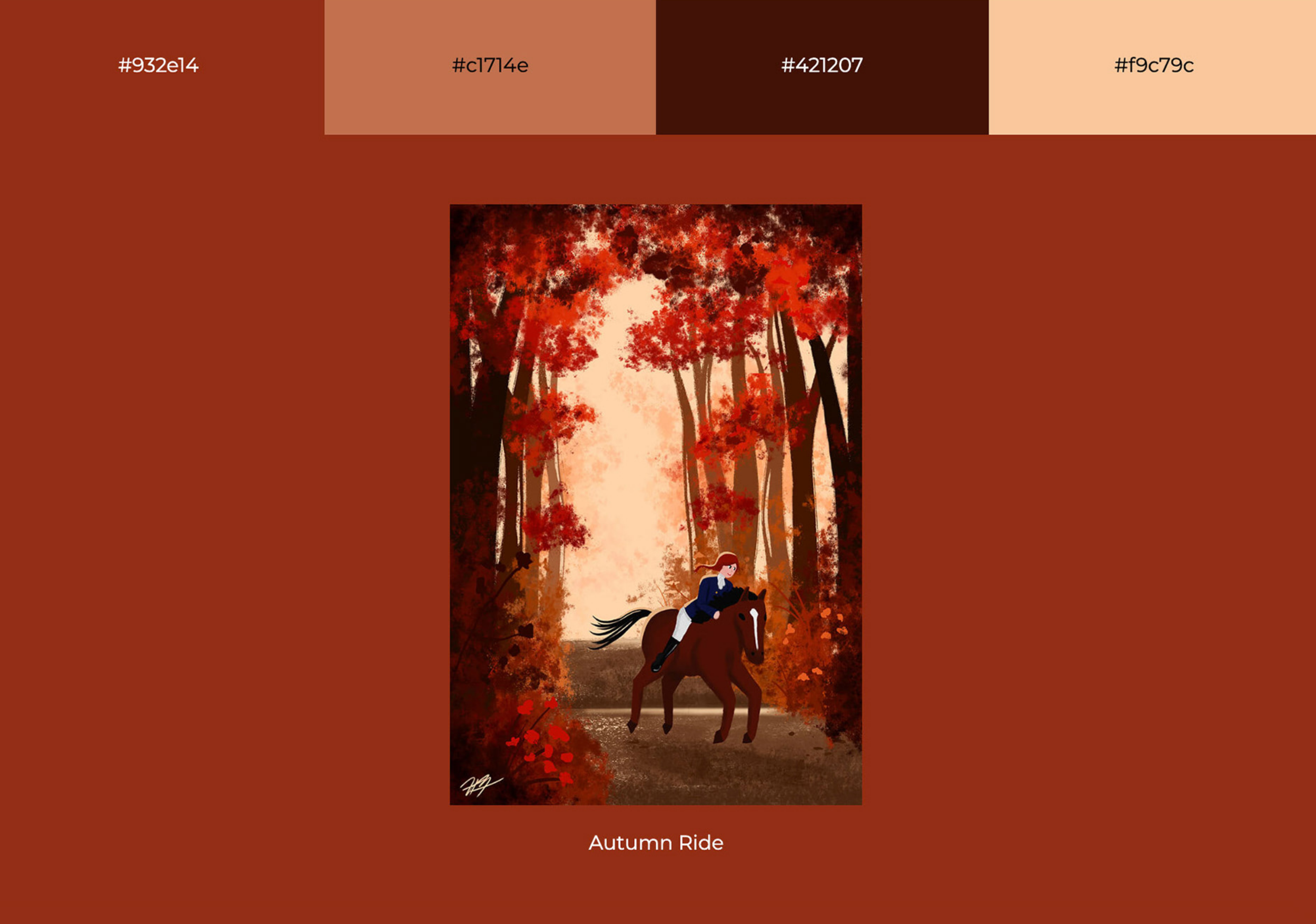
I like to create digital illustrations in my spare time (you can check out my portfolio here!). My art style emphasizes color and lighting to establish mood and atmosphere. I got curious about what my works would look like if I sorted them by dominant color hue.
Snapshot of my work
Same snapshot, blurred to emphasize colors
Technical implementation
To extract the overall hue of an artwork, I determined that a k-means clustering algorithm would be the best for the task, since I just needed to focus on grouping artworks by color hue.
I used the plotly.py graphing library to visualize algorithm results as a histogram chart, with hue categories ranging from red to violet. Since the web application retrains itself each time the page reloads, the calculated dominant hues and histogram chart are different each time.
Various histograms generated. Each color block represents an artwork and its dominant hue, block size is proportional to the art's original dimensions.
Final UI
Learnings
From the histograms generated, despite the variations in results, they're quite consistent. All categorize most of my art into reds and blues. More specifically, it appears that the majority of my work features blue, which I'm not surprised about, given that blue is one of my most favorite colors. Seeing my art this way has inspired me to create more work in the hues I haven't experimented with as often.


